
Web design principles - The four pillars of web design
When people visit your website, the first thing they feel is the design. Even if your website has great functionality, poor design can make those functionalities worthless. So in this blog, I will introduce a few web design principles and their history. I will also share some resources that can help you to design your website.
Let's get started
1. Colour
Choosing the right color is very important and you can't just choose your favorite color. A colorful website does not mean using all the different colors, be consistent and choose a single color as your theme color. When picking colors think about the mood of your color palette.
The five moods of color
Red
Red resembles Love, Energy and Intensity. It is the most powerful, strongest, and brightest on the color wheel. The red theme is mostly used in e-commerce, entertainment, and fashion websites. With great power comes great responsibility - using too much red creates a negative impression on your design. Also, red is not suitable for nature-related websites. Examples:

Yellow
Yellow is for Joy, Intellect and Attention. You should be careful with yellow because using bright yellow as a background can hurt users' eyes especially when your website needs to be used for a long time. Yellow is great for headings, logos, buttons, etc. So to sum up, if your website is something that users need to spend more time then yellow is not the best choice.
Good examples of yellow-themed websites:

Green
Green is about Freshness, Safety and Growth. That's why most grocery, nutrition, and organic products companies use a green color palette. That's how they convey the freshness of their products digitally. So if your website is food or nature-related, then green is your choice.
Here are some examples:

Blue
Blue - Stability, Trust, and Serenity. Now you know why most of the financial companies, and cryptocurrency companies' websites are blue. Also, some major social media sites like Twitter, and LinkedIn are blue-themed because they make people feel safe, trust, and positive using their platform. So use social media to spread positivity 😉.
Examples:

Purple
Finally purple, purple show Royalty, Wealth and Femininity. The words say it all. So the websites which are targeted at women will more likely use purple.
Examples:

Hence, depending upon what message you want to convey to users through your website choose the right color. Of course, you don't just use a single color throughout your website, so use these two tools to combine colors matching your theme color.
2. Typography
Typography is another important part of a website. I saw so many websites fail at choosing the font. If your website has more reading content then font matters. Let's see some history about fonts. There are two large font families.
Serif

The Serif font is inspired by olden days marble carvings. It is hard to carve 90-degree angles, so that's why serif font has triangle-type curvature. Serif typeface makes you feel serious, authoritative, and old. Serif has many sub-types like old-style, transitional and modern.

Like colors fonts also have moods. Now serif font is seen as Traditional, Stable and Respectable.
VOGUE is the best example of a serif typeface.

Sans Serif

Sans serif is Sensible, Simple and Straightforward. Sans serif has perfect right angles. Most startups tend to use sans serif typeface. You can use sans serif for body text because it makes the text more readable.
Tip-1 💡: When choosing fonts don't choose more than two different fonts. Tip-2 💡: Avoid using these fonts - comic sans, kristen, curlz, viner and papyrus. These fonts are difficult to read and are only for fun.
Before deciding on a font family, go through cssfontstack to know which fonts are safe to use.
3. User Interface (UI)
After learning about color theory and typography, the next thing you need to know about is User Interface design. UI is about how you use and arrange things on your website. There are five factors of UI - 1.Hierarchy, 2.Layout, 3.Alignment 4.Whitespace and 5.Audience. Let's understand these factors with examples.
Hierarchy
A quick example of text hierarchy:

Here the main thing is whose certificate is that and for that left one is more appropriate. Users may not have time to read all the text, for that highlight the most important information first hierarchically.
Example for color hierarchy:

See the spots highlighted by green boxes. These are the things most people consider about a product, right? So that is a color hierarchy. Use color cleverly to highlight the things that need to attract the users.
Example for size hierarchy:

Now see this Netflix signup page. Here 1 > 2 > 3 in size. The first thing they want to show visitors is what Netflix is about. The second preferred thing is they want your email. And the third thing is small compared to the other two because they don't consider it that much.
Layout
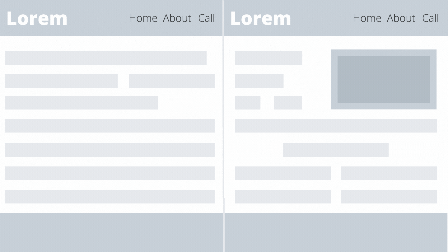
The layout is about how you arrange your website elements. Don't be so bland by putting everything in the same place as Wikipedia. Separate elements into different parts. If there is so much text, cut each line to 60 characters.
Check this out - csslayout
Alignment
Alignment is about how you position an element relative to other elements.
See this example:

Got the difference? Even if both websites have the same content just alignment of different elements makes big difference.
Whitespace
Whitespace refers to space around elements.

Audience
Yes, the audience is a factor of UI. Know your target audience, and design for your audience. For example, the theme for YouTube and YouTube kids is different.

All the gaming websites' theme is completely different from other websites.
4. User Experience (UX)
Let's move on to UX. Until now we tried to attract users, but now we need to impress the user. While UI attracts the user, UX makes the user comfortable using your website. Again, there are five factors you need to consider in UX - 1.Simplicity, 2.Consistency, 3.Reading Patterns, 4. All platform design and 5. Dark Patterns
Simplicity
Too much content at the same place brings headaches to the users as they can't understand where to look. Keep things simple by arranging and reducing the content. Simple is beautiful. Amazon's website has bad UI and UX(If you know the reason comment below), but there are so many e-commerce websites with simple designs.
Consistency
Consistency makes your website easy to understand and easy to navigate, especially if your website is used by non-tech people or kids, or old people.
Reading Patterns
Reading patterns refers to how a user looks at your website. There are some layouts called Z-layout, F-layout, etc.., which can be used to design the layout of your elements.
F-Layout
In the f-layout important content will be on the left side. See this example,
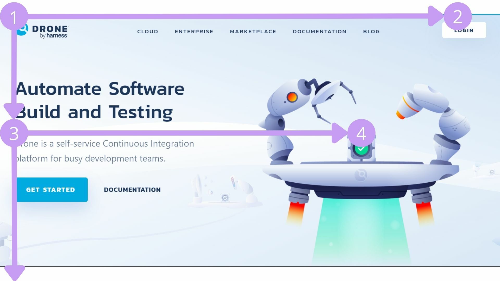
Z-Layout
Z-Layout includes a logo(1), a signup button(2) or something like that, some text(3), and a call to action button(4).

All platform design
At the end of the day, you don't just create a website for desktops only, it needs to be responsive among different devices.
Avoid dark patterns
Dark patterns refer to actions that trick the user for the benefit of the company. You may get short-term benefits, but you will fail in the long run.
So, if you follow these principles, then you can make a great design.

What other principles would you consider for a good web design? Comment below 👇
⚒️Tool of the week⚒️
- Thinking too much to name variables and functions?😂 Then this tool is for you!
I hope you enjoyed reading this.
LEAVE A COMMENT OR START A DISCUSSION
MORE ARTICLES
3 min read
Introducing Publish Studio: Power Digital Content Creation
Say “Hi” to Publish Studio, a platform I’ve building for the past few months. If you are a content writer, then you should definitely check it out. And if you are someone who has an audience on multiple blogging platforms and need an easy way to manage your content across platforms, then you should 100% give it a try.

10 min read
Let's Build a Full-Stack App with tRPC and Next.js 14
Are you a typescript nerd looking to up your full-stack game? Then this guide is for you. The traditional way to share types of your API endpoints is to generate schemas and share them with the front end or other servers. However, this can be a time-consuming and inefficient process. What if I tell you there's a better way to do this? What if I tell you, you can just write the endpoints and your frontend automatically gets the types?